- Home
- Birthday Cards
- Color Theory
Understanding Color Theory
Understanding color theory is the first module in the 'A Study of Color for the Card Designer' course.

Click on any image
for gallery or expanded view.
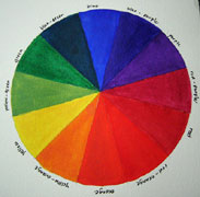
According to Isaac Newton (1642 - 1727), color originates in light. When light is refracted through a prism, it gives out the seven colors of the rainbow; red, orange, yellow, green, cyan, indigo, and violet.
Since Newton's discovery, other color theories have been presented by scientists as well as artists.
Primary Colors
Based on Newton's color theory, the three primary colors are:
red, yellow and blue.
These are pure hues that cannot be formed by mixing any colors. All other colors are derived from these three primary colors.
Secondary Colors
When we mixed two primary colors together, another color is formed.
Examples:
- red + blue = purple
- blue + yellow = green
- yellow + red = orange
These colors; purple, green and orange are called secondary colors because they are formed by mixing two of the primary colors together.
Tertiary Colors
When we mix a primary and a secondary color, we form another set of colors. These colors formed are called tertiary colors or intermediate colors.
Examples:
- red (primary) + orange (secondary) = red-orange (tertiary)
- red (primary) + purple (secondary) = red-purple (tertiary)
- blue (primary) + purple (secondary) = blue-purple (tertiary)
- blue (primary) + green (secondary) = blue-green (tertiary)
- yellow (primary) + orange (secondary) = yellow-orange (tertiary)
- yellow (primary) + green (secondary) = yellow-green (tertiary)
Color Theory Recap
- Primary Colors: red, blue, and yellow
- Secondary Colors: purple, green, and orange
- Tertiary Colors: red-orange, red-purple, blue-purple, blue-green, yellow-orange, and yellow-green.
Complementary Colors
Complementary colors are colors that are opposite each other on the color wheel. Example, red and green are complementary colors. They do not share common colors since green is derived from yellow and blue.
Complementary colors, when used together in a card, give contrast. Example, red and green used on Christmas cards give us a feel of festivities and excitment. There are vibration and excitement when complementary colors are placed side by side. So if you want to grab attention or create a focus point, use complementary colors.
For example, when you walk along the aisle of products in the shopping centre, just notice the labels on the packaging. You will see complementary colors used in most of the labels and packaging. Complementary colors demand attention and create visual energy.
Harmonious Colors
Harmonious colors are colors that sit next to one another.
Example, yellow, yellow-green and green.
 |
Next: Making a Color Wheel |
Making Greeting Cards! › Color for the Card Designer › Colour Theory
Share Your Thoughts!
Like This Site?
|
| |
Celebrating Creativity! Connecting Lives!
~ bringing cheer one card at a time.
Help Me Get The Word Out

If you like making greeting cards and want to encourage others to do so because of its many benefits, please help me share this website with your friends. Just click on the share buttons below to share with your fans and friends. Thank you for sharing the good things in life :-)

Hi! Welcome to my card-making website. My name is Flora and I'm an avid crafter and love creating stuff with paper.
I love to connect with you so do sign up for my e-newsletter which is totally free and receive fresh news every month.
Recent Articles
-
Shaped Birthday Greeting Cards Are So Fun and Unique
Aug 01, 23 01:41 AM
 Let's make Birthday greeting cards in various shapes. Why just a regular card? Make it fun with all kinds of shapes for your diy birthday cards or invitation cards. These birthday fun cards are great…
 -
Cards Verses for Your Greeting Cards
May 15, 23 05:10 AM
 List of cards verses for all occasions. Need words, quotes or poems? Free wordings to use for your greeting cards.
 -
Heartfelt Birthday Wishes for Friends and Family
May 15, 23 05:04 AM
 Birthday wishes for friends and family to include in your birthday cards.
 -
Other Card Makers And Their Handmade Cards
Oct 08, 21 01:16 AM
So many card makers have sent in their handmade cards. View their creations and be inspired by their card making style and techniques. -
Barbara Phelps 4 - Fourth Page of Handmade Cards
Oct 08, 21 12:04 AM
 Barbara Phelps 4 is the fourth page of beautiful handmade cards personally created by Barb, a creative crafter and reader of this card-making site.
My Other Websites
Copyright © 2004-2023 Flora Tan | Making-Greeting-Cards.com (aka HeartInCard.com ) | All rights reserved.
Making-Greeting-Cards.com has affiliate partnerships and may earn commission on products purchased through affiliate links. These partnerships do not influence our editorial content. Making-Greeting-Cards.com does not sell any personal information.
New! Comments
Have your say about what you just read! Leave me a comment in the box below.