- Home
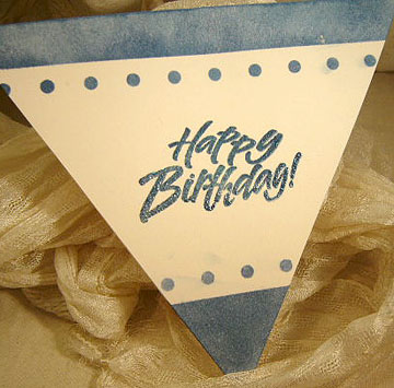
- Birthday Cards
- Color Guidelines
Seven Basic Color Guidelines
for Color Harmony in Cardmaking
Here are some color guidelines for choosing the right colors for our handmade cards.
Before you sit down to create your homemade cards, just run through these basic guidelines and you should be able to decide on a color palette for your homemade greeting card and thus make sure that there's balance and color harmony for your handmade art.

And once you have decided on this, you will be able to easily look for relevant materials to use for creating the card.
Seven Basic Color Guidelines
- Know who you are making that particular card for? The sex and age of the person, his or her likes and dislikes - all these are deciding factor in choosing colors when making cards for a particular person in mind.
- What is the occasion? A festive or holiday card calls for a festive color palettes whereas a Sympathy Card needs a more subdued set of color palettes.
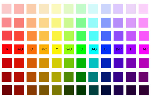
- What is the message you want to bring to the recipient? Colors communicate emotions and many times, speak more effectively than words. For example, red is a powerful color. It's the color of love - which is very appropriate for a Valentine Card. It's also the color that warns of danger which we see being used for traffic lights and danger signs.
- Set a color tone by choosing a dominant color. This could be a light tint of a hue or its dark shade. It is this main color that will set and bring out the overall effect of your card design. Then add one or two accent colors that match the first color you have chosen.
- Do not use too many colors in your design. Two or three colors should be sufficient. More than that, you will need to be very careful that the colors don't crash or cancel out one another.
- Use black, gray or white to bring harmony to your color scheme. Black, grey and white go well with any color palettes. Use either one of these to bridge two strong contrasting colors. You can use this for texts, frame or just the outline of your pictures or cliparts.
- To play safe, use the colors of nature. Natural colors are familiar colors that we see around us all the time. For example, the color of autumn; brown, orange and red.
So lets hope that the above seven basic color guidelines will help you in making beautiful handmade cards for friends and family members.
Have fun and be creative!
You might like these
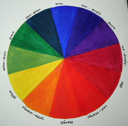
Making A Color Wheel
Paint a color wheel for your own color reference. Step-by-step nstructions on how make this color chart.
Color for the Card Designer Course
Color for the card designer course is designed to help us understand color and how to use them creatively in card making.
The Blue Color Palette For Masculine Cards
The blue color palette is a good range of colors especially for man's cards. Includes a full color chart.
Like This Site?
|
| |
Celebrating Creativity! Connecting Lives!
~ bringing cheer one card at a time.
Help Me Get The Word Out

If you like making greeting cards and want to encourage others to do so because of its many benefits, please help me share this website with your friends. Just click on the share buttons below to share with your fans and friends. Thank you for sharing the good things in life :-)

Hi! Welcome to my card-making website. My name is Flora Grace and I'm an avid crafter and love creating stuff with paper.
I love to connect with you so do sign up for my e-newsletter which is totally free and receive fresh news every month.
Recent Articles
-
Shaped Birthday Greeting Cards Are So Fun and Unique
Aug 01, 23 01:41 AM
 Let's make Birthday greeting cards in various shapes. Why just a regular card? Make it fun with all kinds of shapes for your diy birthday cards or invitation cards. These birthday fun cards are great…
 -
Cards Verses for Your Greeting Cards
May 15, 23 05:10 AM
 List of cards verses for all occasions. Need words, quotes or poems? Free wordings to use for your greeting cards.
 -
Heartfelt Birthday Wishes for Friends and Family
May 15, 23 05:04 AM
 Birthday wishes for friends and family to include in your birthday cards.
 -
Other Card Makers And Their Handmade Cards
Oct 08, 21 01:16 AM
So many card makers have sent in their handmade cards. View their creations and be inspired by their card making style and techniques. -
Barbara Phelps 4 - Fourth Page of Handmade Cards
Oct 08, 21 12:04 AM
 Barbara Phelps 4 is the fourth page of beautiful handmade cards personally created by Barb, a creative crafter and reader of this card-making site.
My Other Websites
Copyright © 2004-2024 Flora Grace | Making-Greeting-Cards.com (aka HeartInCard.com ) | All rights reserved.
Making-Greeting-Cards.com has affiliate partnerships and may earn commission on products purchased through affiliate links. These partnerships do not influence our editorial content. Making-Greeting-Cards.com does not sell any personal information.
New! Comments
Have your say about what you just read! Leave me a comment in the box below.